Predominately, the building is a dirty shade of white. Painting walls into ceilings in resting areas helps to delineate those spaces and further highlight where colour has been used to create focal points of interesting architectural details.
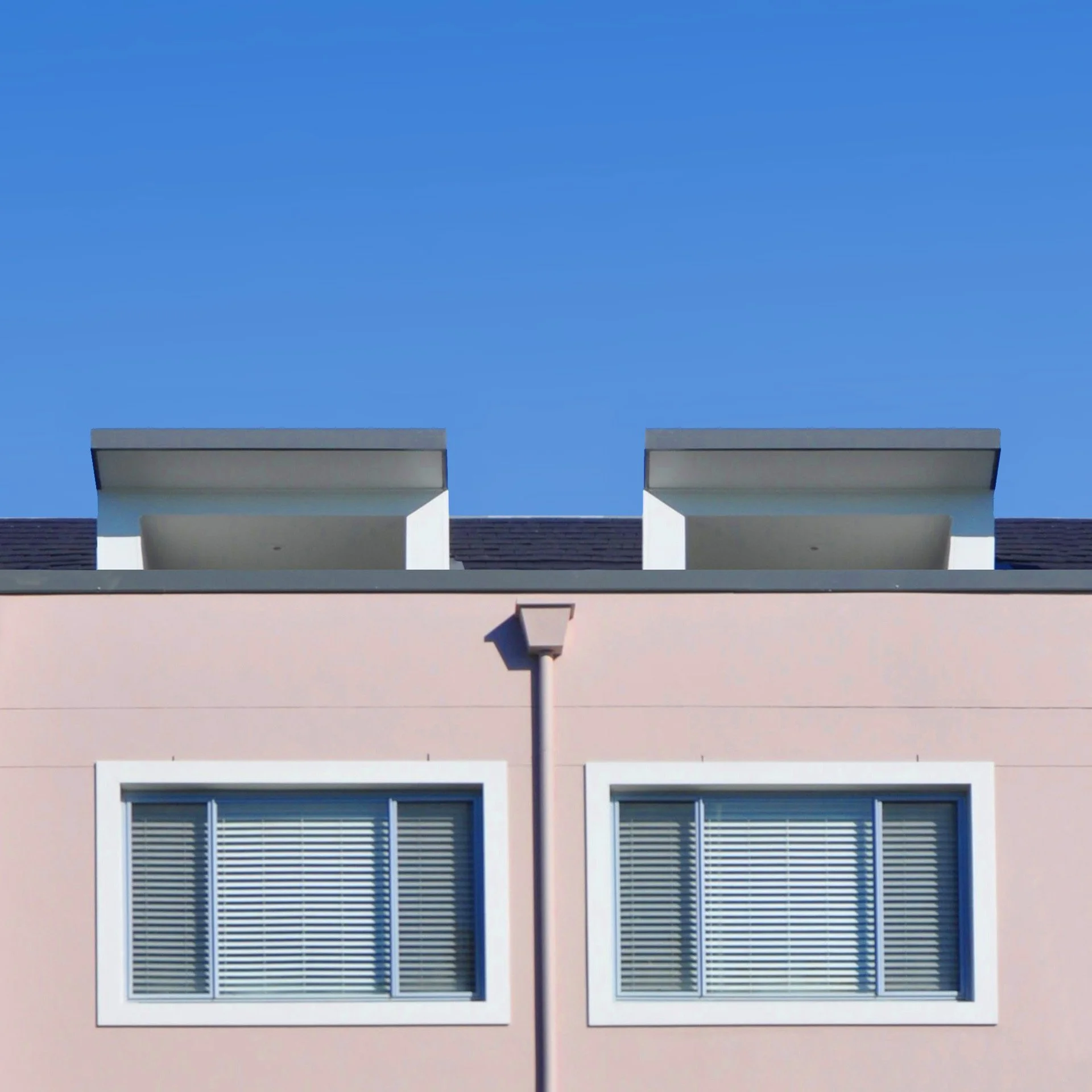
The dusty-pink colour-blocked areas create a fresh contrast with the dark khaki and charcoal elements. Featured window sills help pull the pink back into the facade.
The dark khaki—a lick custom-colour—highlights the building’s entrance, and anchors boundary and garden retaining walls into the surroundings.
The warm and cool colour combination creates a masculine to feminine ‘push-pull’ and blurs boundaries.
I've been working as a colour consultant with strata committees for years now and often there’s a tendency to play it safe. It’s exciting and rewarding when they’re willing to be more adventurous and create something the community can enjoy.The most successful colour outcome will consider the building’s form, its location, the surrounding environment and the requirements of the inhabitants.