Interior design refurbishment for Sydney-based accessories designer Peter Lang, for his Victorian terrace in Elizabeth Bay.
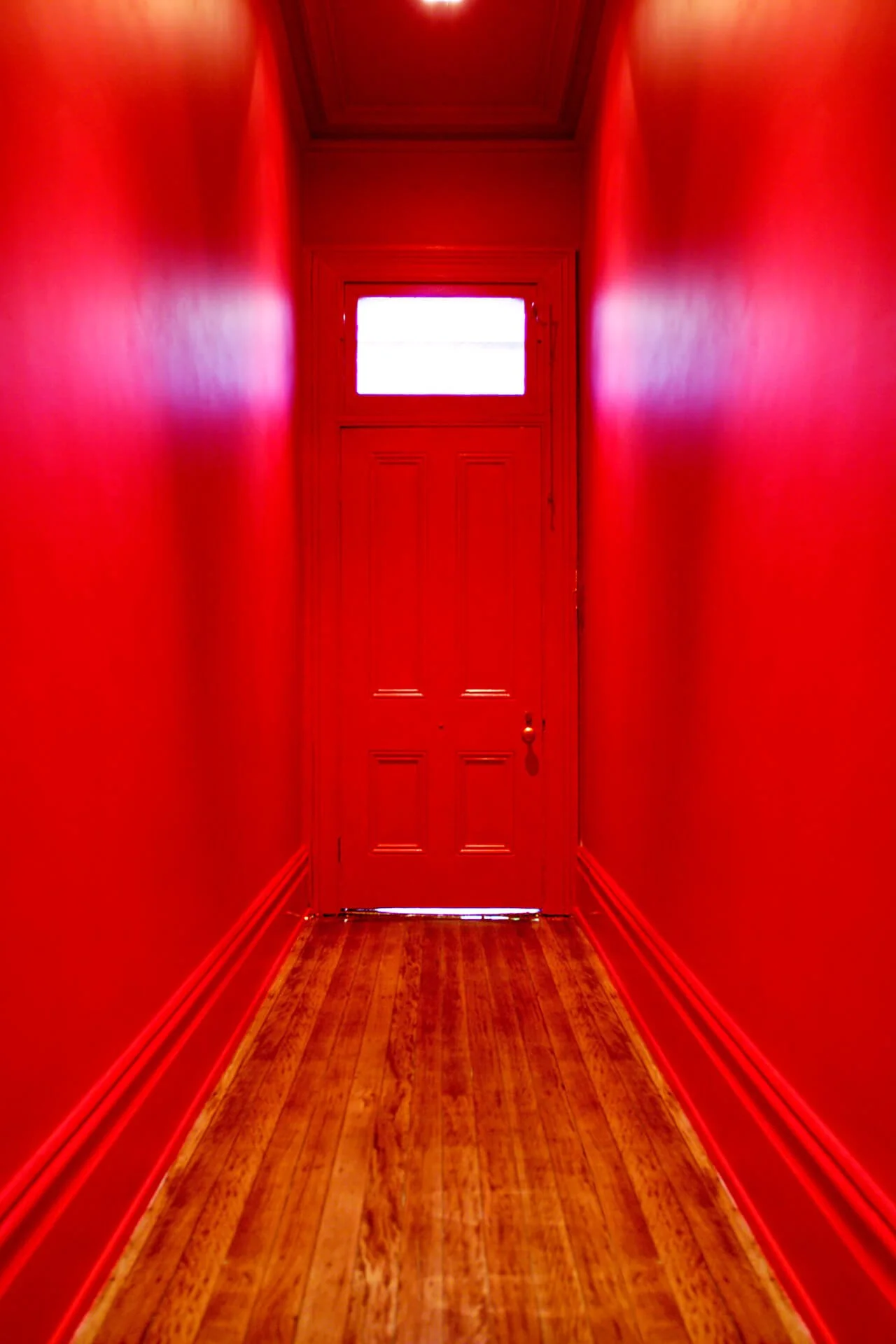
Immediately behind the terrace’s black, streetscape-safe front door a bold, spicy scarlet red used on the walls and the ceiling is the very epitome of ‘wow factor’.
Throughout the interior a custom-mixed cool white provides the perfect backdrop for swathes of strong colour and Peter’s impressive art collection. Confident statements in purple and rust surround the original marble mantelpieces and echo hues found in the paintings in the living room.
The pièce de résistance of the living room’s scheme is the Klein Blue ceiling, where the wondrous colour frames the black Murano chandeliers.
At the rear of the terrace, the calm, white kitchen-dining area provides the perfect counterpoint to the world of colour up front.
Retro-style directional spot lights take centre stage over the kitchen island grouped in a tight row of five, making the fitting look more substantial and providing enough light for the entire room.
The selection of finishes here includes a smoked-mirror splashback that reflects the solid, sensuous island bench of chocolate and honeycomb marble over walnut veneer.
Providing a serene and sumptuous transition to the upper level, one stairwell wall features a blackened navy. The colour’s depth offsets a quirky plate collection and rusted steel sculpture and offers a striking contrast to the emerald green which wraps from the landing into the hall.
In the master bedroom, the substantial grey-brown was chosen for its complexity, and to create a rich masculine ambience, juxtaposing the white Murano chandelier. The guest bedroom is enveloped in a luxurious dark green-grey.
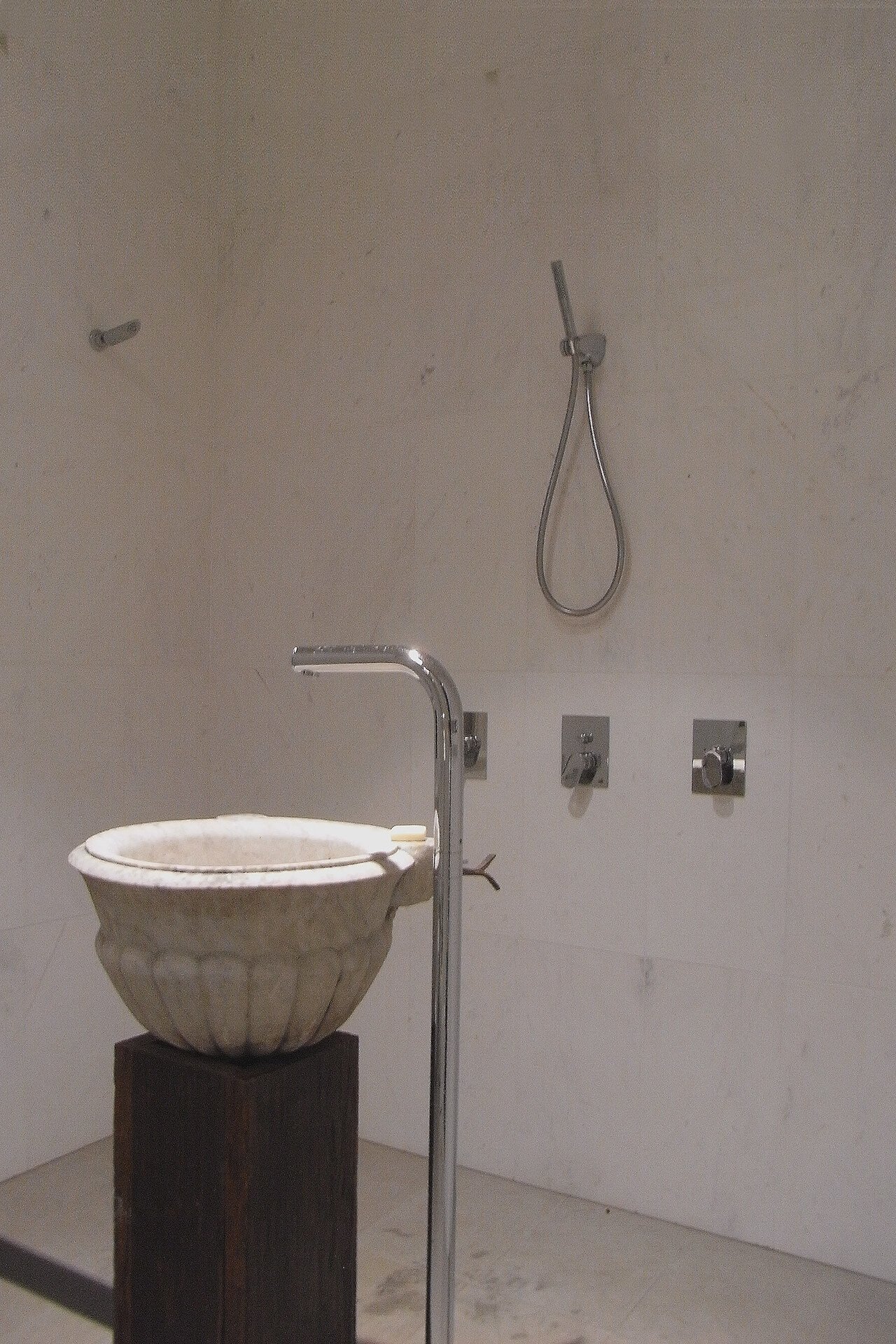
The existing toilet under the staircase has been transformed into a powder-shower room. In-ground LED up-lights have been used in the shower recess floor to wash light up the walls and bounce light around the room.
Peter’s home shows what’s possible when colour boundaries are pushed. The result is a sublime palette choreographed to enhance and balance the moods of the rooms while showcasing Peter’s beautiful collectibles. Clever use of vibrant hues balanced with complex neutrals creates a sophisticated and indulgent colour scheme.